coronavirus-map
Coronavirus Map
Read this in: Français
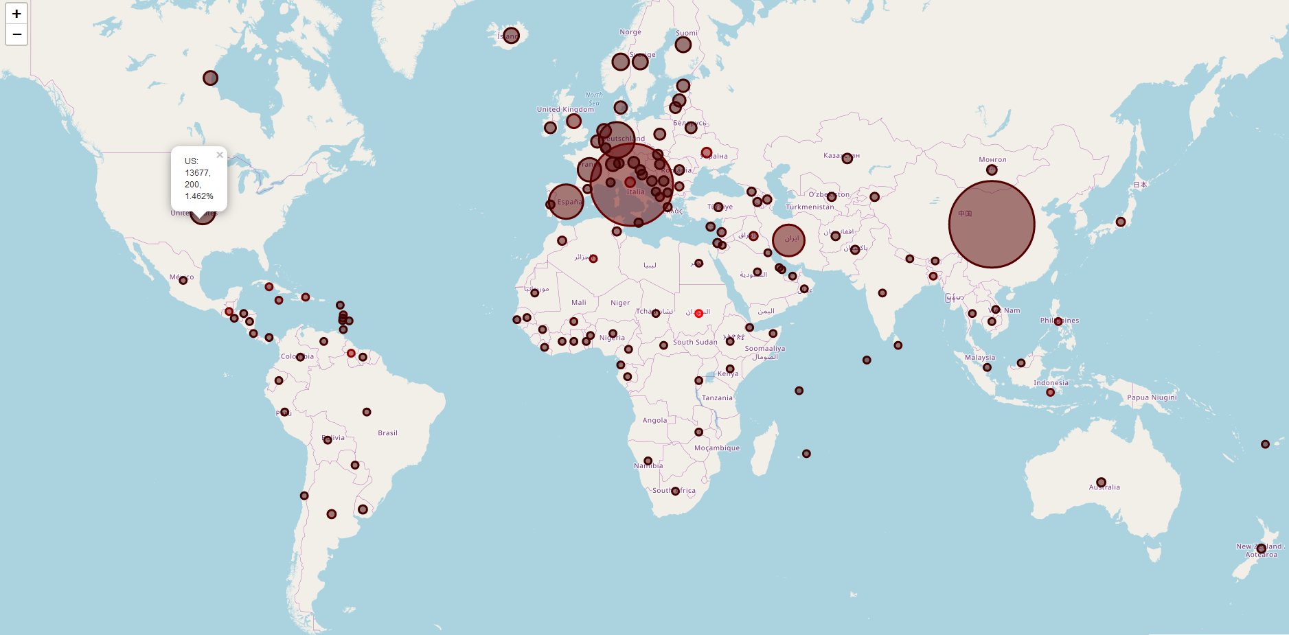
This is a map which shows the number of cases, deaths, and mortality rate for each country. Visually, it shows this through circle sizes and the redness of them.
An up-to-date view can be found here.
How It Works
The python script accesses another repository by pomber to get the current number of cases and a csv file to get the latitude and longitude of each country. After that, it uses the folium library to map it.
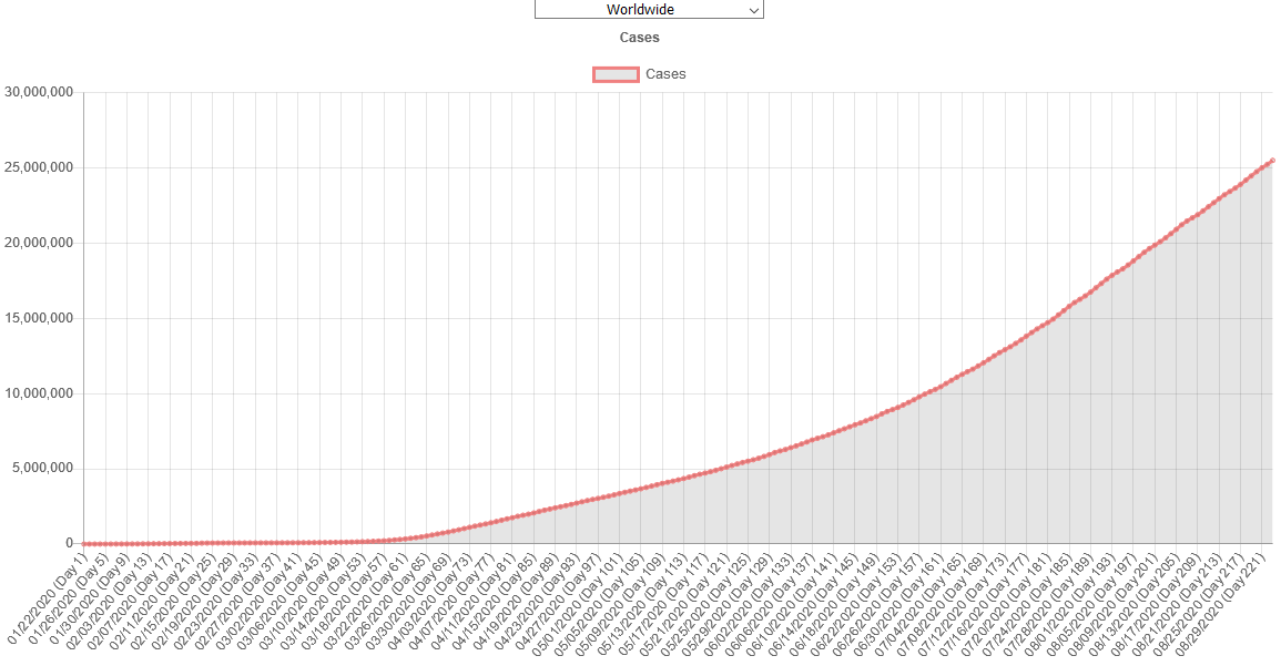
The second page is the graphs page, made with Chart.js. This allows you to see the number of cases worldwide, or in a specific country, since January 22, 2020.

